Packaging Design | Typography
Crate and Barrel
Black and White Collection
Overview
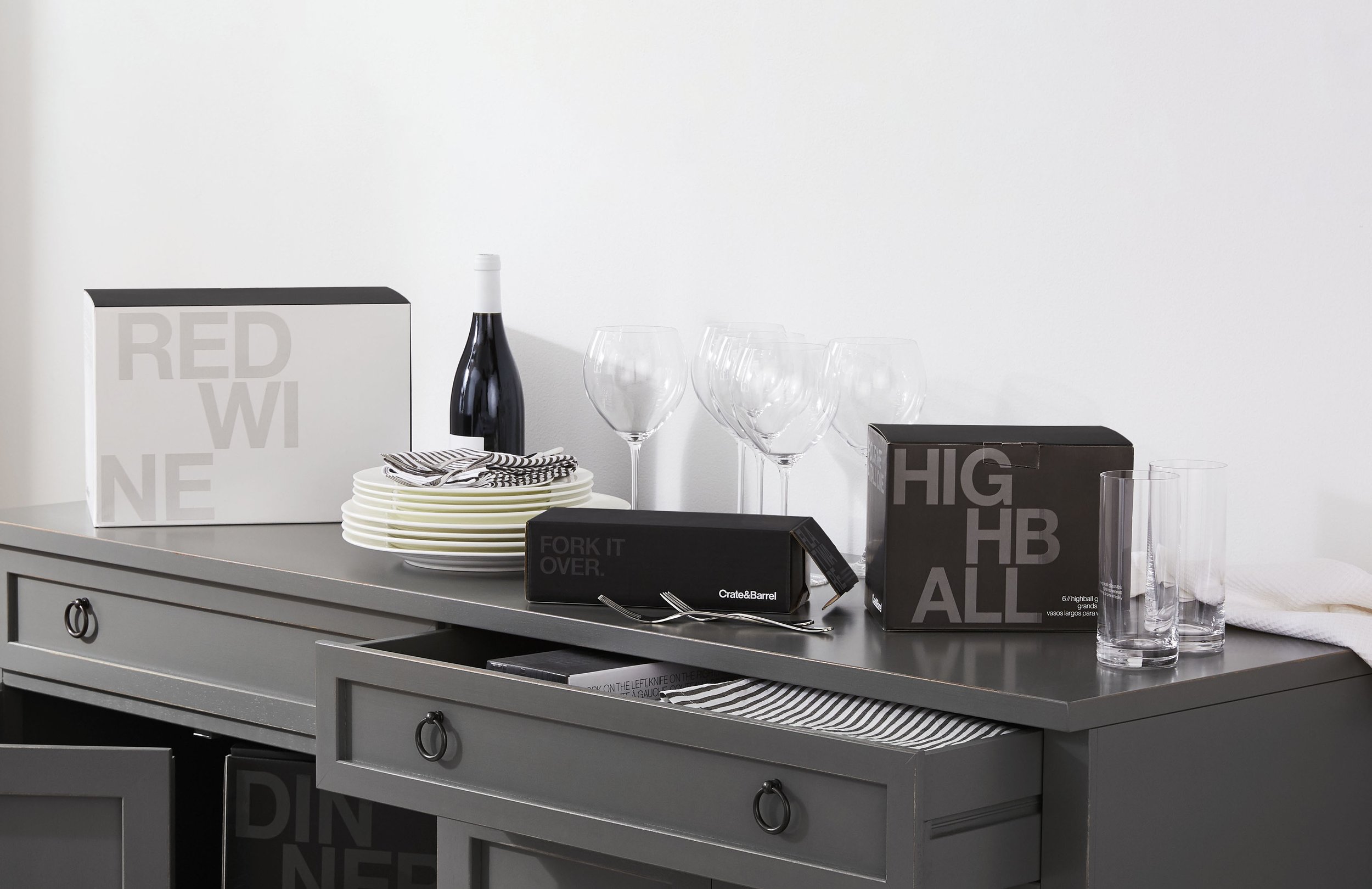
This collection of dinnerware, flatware, and glassware represented something new for the brand. It wasn’t the basic, everyday product lines and it wasn’t the high end pieces that many added to their gift registries, it was in the middle–a more casual choice to use to entertain a few good friends at home, even if you’re just catching up over drinks and snacks around the kitchen island.
Problem
The challenge was to create packaging that fit the elevated, modern, and fun nature of the product itself and set it apart from Crate’s Basics line of glassware, dinnerware, and flatware as well as from the higher end products usually reserved for special occasions. The sets of 6 were targeted to people hosting friends and family for dinner parties or small gatherings where there was a desire for elevated tableware with a wink of humor brought in on the packaging. Another challenge was to create packaging that customers would actually want to keep and use it to store the product when it wasn’t in use.
Role
Lead designer responsible for research, sketching, design, building full scale mockups, stakeholder presentations, and production
Process
Research
Concept Sketches
Design
Editorial Collaboration
Mockup Construction
Stakeholder Presentations
Iteration
Production
Solution
The packaging for this collection was successful in differentiating the product line from others offered in-store and online. The layout of the typography and the use of spot UV varnish on the printing made the packaging feel elevated and modern with a hint of trendiness while remaining on brand with the use of black and white and the classic Helvetica typeface that Crate is known for.
Tools
Illustrator
Duration
3-4 months
Research
TARGET AUDIENCE:
Nontraditional or younger Crate and Barrel customer
(“Savvy Stylist”) and new customers interested in elevating their tableware
Ages 28-45
VISUAL STRATEGY:
• Create special packaging that was as aesthetically pleasing as it was functional
• Elevated, modern, fun
• Typography is primary focus
• Include special finishing (UV varnish, embossing, foil stamping)
• Lean into core brand palette (black and white)


Initial Concepts
Research: Competitors
Restoration Hardware
West Elm
Williams Sonoma
Design Process
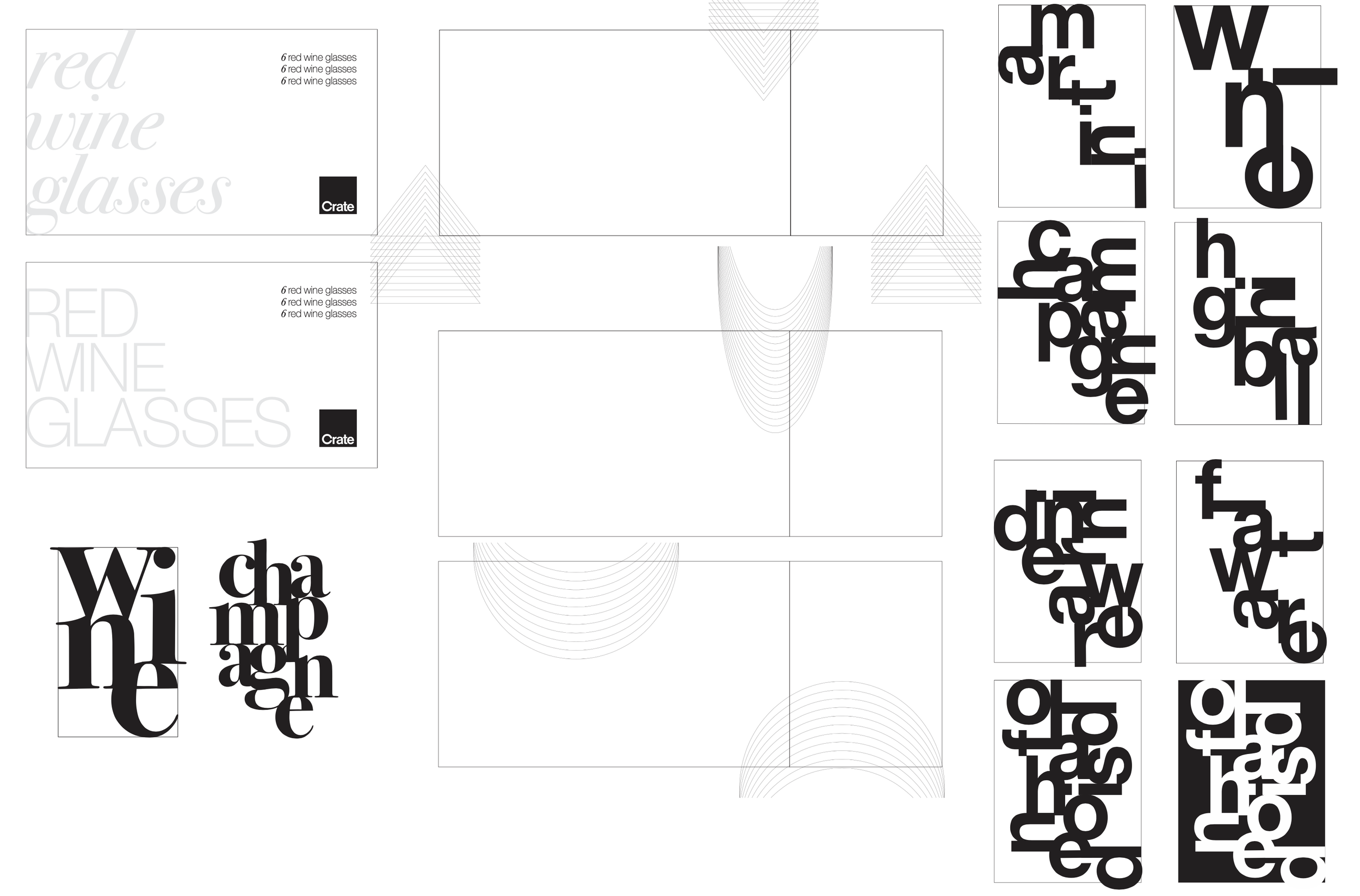
The visual strategy for this collection was focused on typography. I chose to focus on a type only solution because the product would not be available in time to schedule a photo shoot to be able to use product photography on the package and the basics collection, which were sets of tableware that already existed, used product illustrations on their packaging. The goal of the Black and White Collection was for it to be an elevated option from the basics sets.
I experimented with Helvetica as well as Bodoni, which was the serif typeface Crate sometimes used. I wanted to used the letter forms as visual texture as well as a means of messaging. How to best utilize the contrast of the black and white within the packaging was also a big consideration in the early stages.
Concepts Round 1
Concepts Round 2

Stakeholder Presentation Mockups: Option 1

Stakeholder Presentation Mockups: Option 2
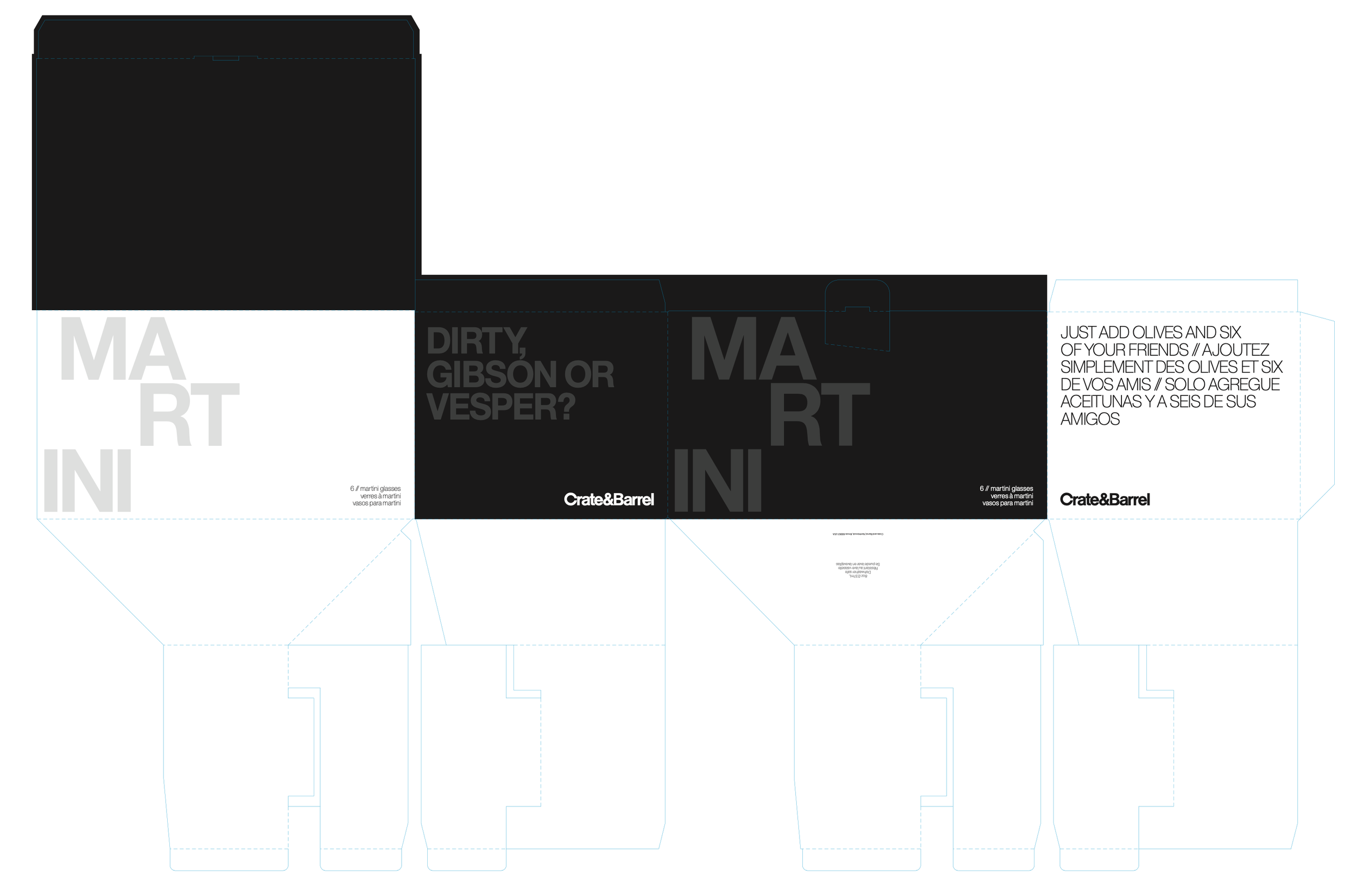
Final Die Line Mockups and Final Packaging
The direction that was selected to move forward with included a strong balance of black and white, an elegant and subtle change in surface texture with the spot UV varnish, and bold typography that was played down slightly with the tone on tone effect achieved in printing.
My editorial partner developed light-hearted copy for each product box in order to achieve a more playful, casual vibe for the collection. The copy was embedded within the design but acted as a fun discovery for those who took the time to notice.


In-store Display
Takeaways
The packaging for this collection was successful in differentiating the product line from others offered in-store and online. The layout of the typography and the use of spot UV varnish on the printing made the packaging feel elevated and modern with a hint of trendiness while remaining on brand with the use of black and white and the classic Helvetica typeface that Crate is known for. This collection launched in 2018 and remained a strong seller for several seasons to follow.
My personal takeaways included having the opportunity to create my first packaging collection from concept to execution, becoming more familiar with working with vendors to achieve the desired final product within budget, and collaborating with a member of the editorial team to infuse a fun voice into the copy as well as working together on how the copy would work visually.