Brand Identity | Web Design | Print Design | Infographics
FELA
Overview
The Family Educator Learning Accelerator (FELA) is a program that facilitates the collaboration of students, their families, and their teachers in order to help kids reach their growth goals in reading through practice at home as well as in the classroom. The program is part of Springboard Collaborative and was developed in the spring of 2020 in response to the COVID-19 global pandemic.
Problem
To create a brand identity for an educational organization nested under a larger organization. The challenge was to create an individual identity for FELA while drawing a connection to its parent organization, Springboard Collaborative.
Role
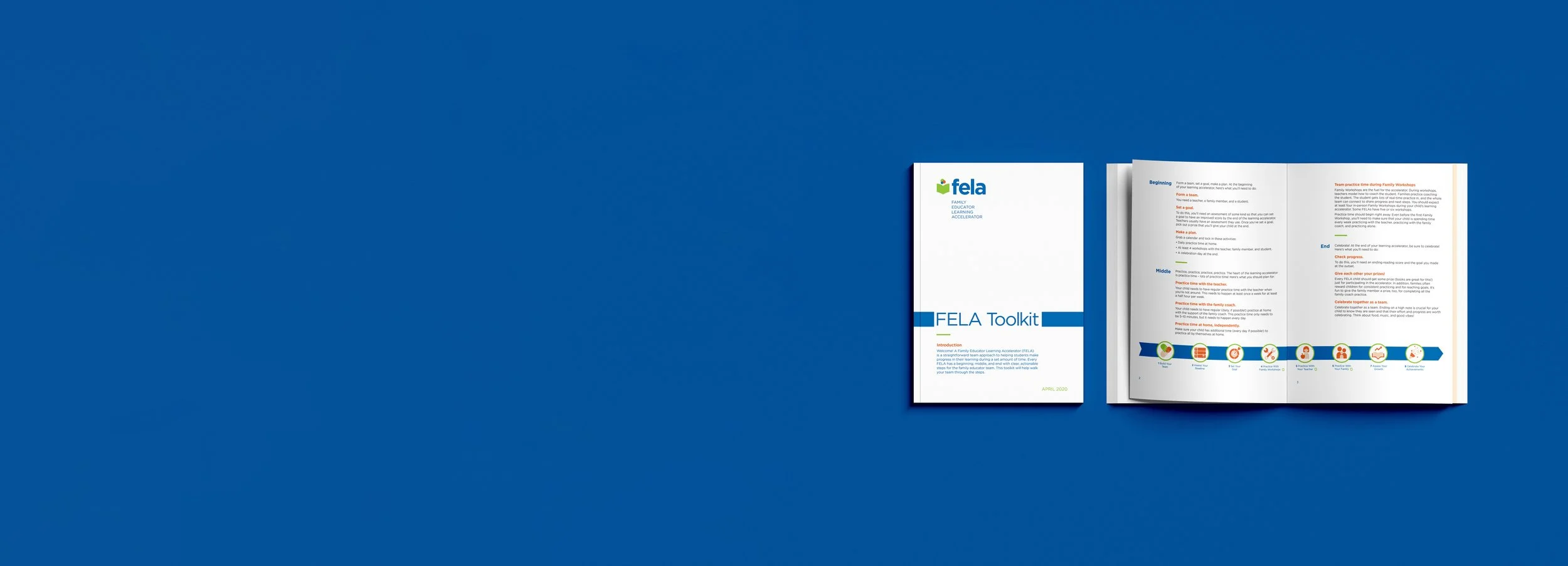
Lead designer responsible for logo design, iconography, infographics, printed and digital toolkit document, and client communications
Process
Research
Concept Sketching
Design
Iteration
Production
Solution
I was able to achieve a look and feel that was informative yet joyful in order to help spread FELA’s programming to more families in the city of Philadelphia.
Tools
Illustrator
InDesign
Photoshop
Duration
1-2 months
Vertical Logo (lowercase)
Horizontal Logo (lowercase)
Vertical Logo (upper case)
Horizontal Logo (upper case)
Brand Identity, Icons, and Infographics
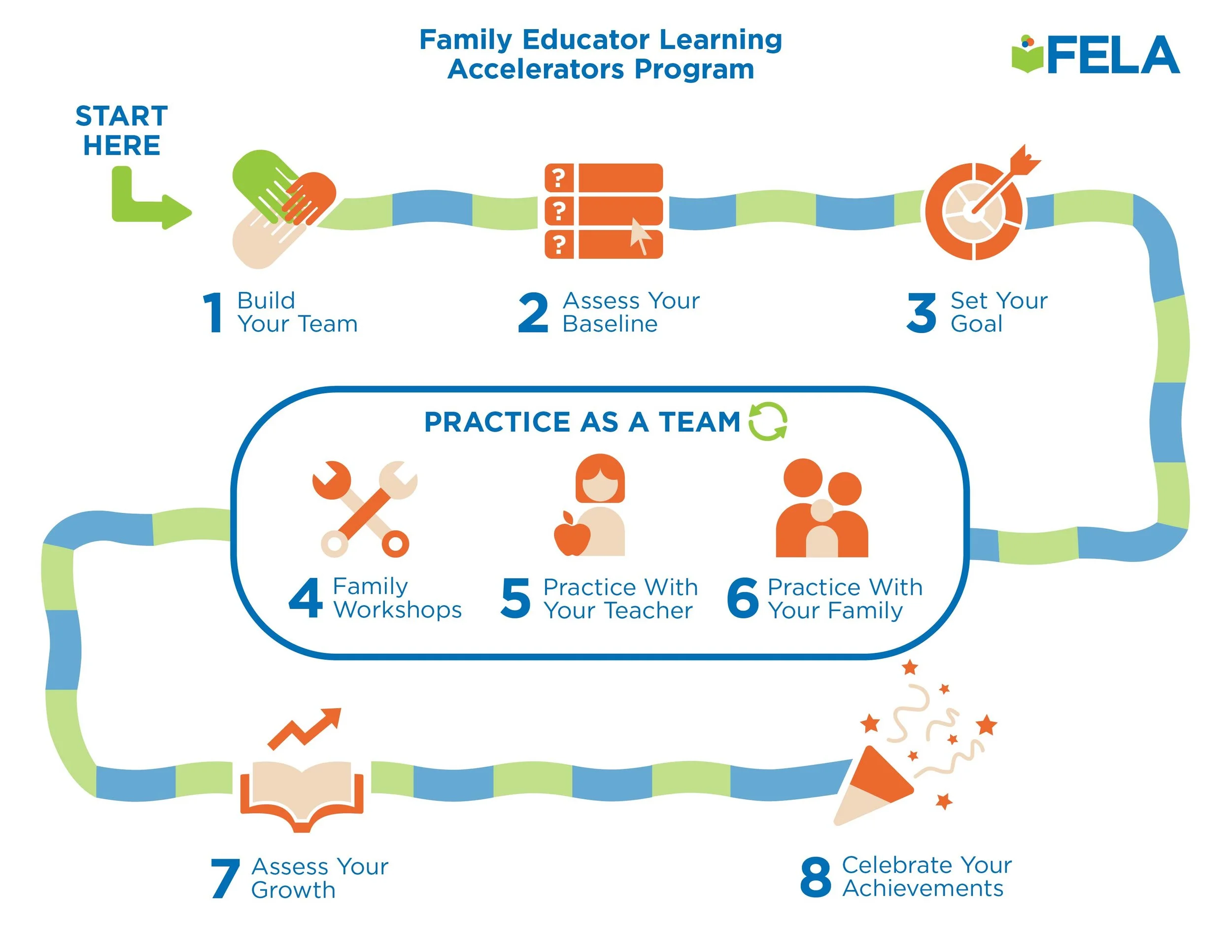
The logo mark’s three overlapping circles placed over one piece of reading material to represent each member of the team (student, family member, teacher) working toward a single goal, to see improvement in the student’s reading skills and abilities.
FELA’s iconography worked to communicate as well as delight. The bright colors and graphic simplicity are eye-catching and easy to understand. The choice to use the oranges on the icons allowed them to stand out among the blues and greens used in the backgrounds of the infographics.
Build Your Team
Assess Your Baseline
Set Your Goal
Family Workshops
Practice with Teacher
Practice with Family
Assess Your Goal
Celebrate Achievements
How it Works Infographic (General Use)
How it Works Infographic (Administrator Use)

Web Design
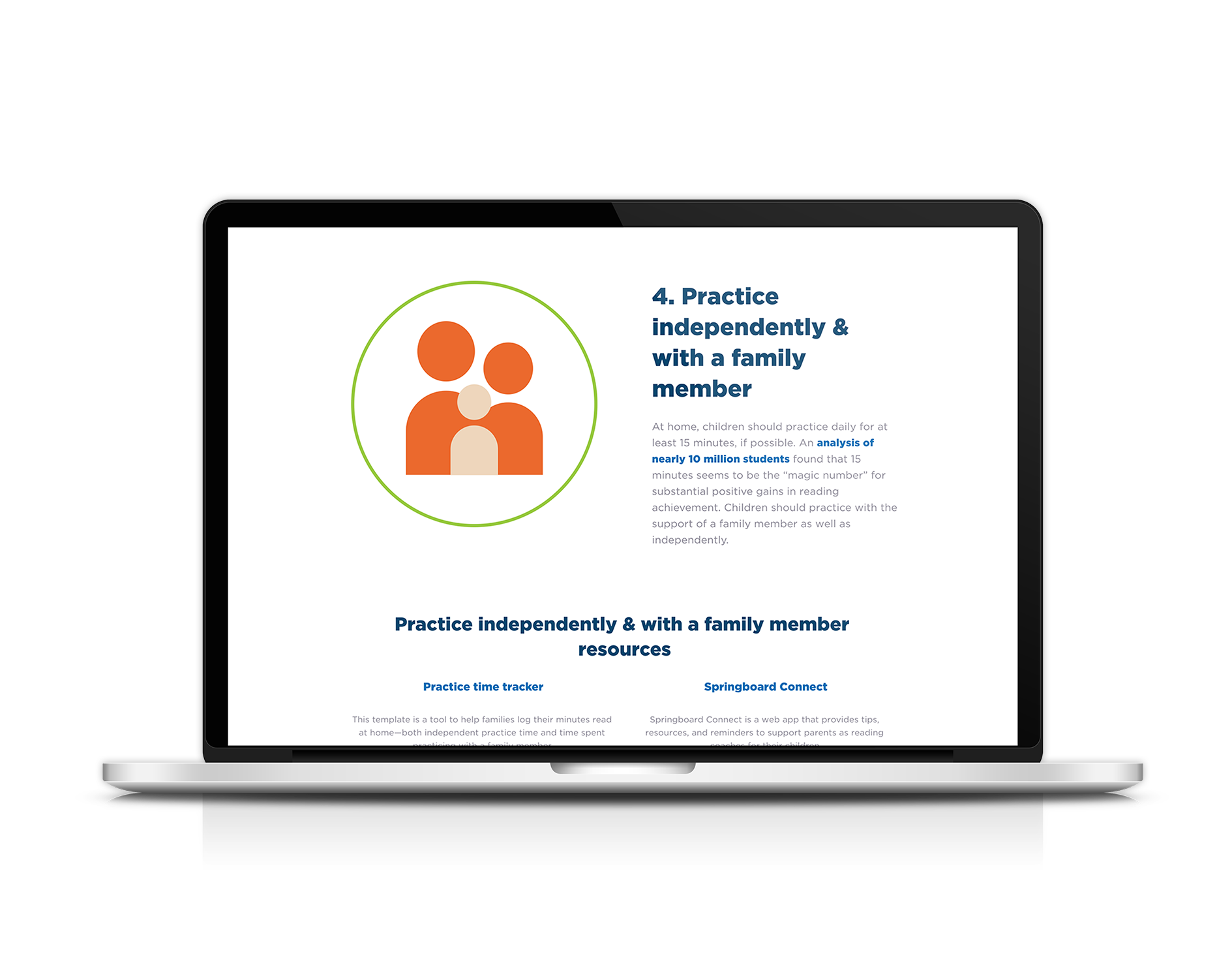
To expand upon the FELA brand, I created some designs for their website on my own after having worked with them. I wanted to communicate the warmth and community-focused mission of the platform, reiterating the look and feel established in the logo, print materials, and infographics.
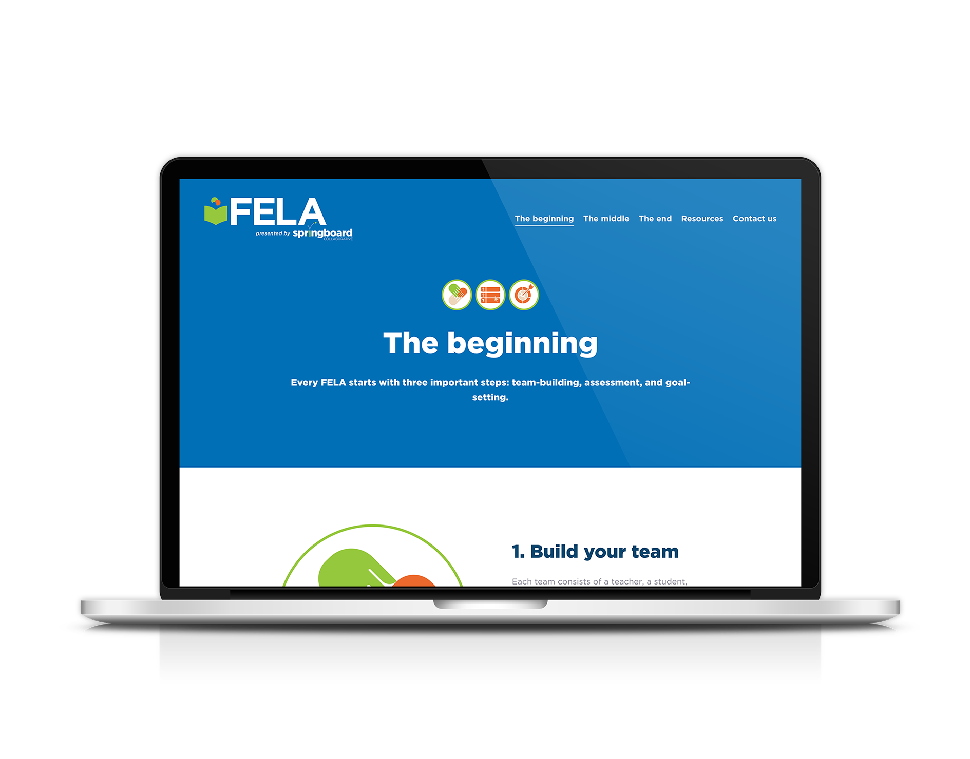
How it Works: The Beginning
How it Works: The Middle

How it Works: The End

Resources Page

Contact Us Page