Art Direction | Print Design | Experiential Design | Digital Marketing
Crate and Barrel
Credit Card
Overview
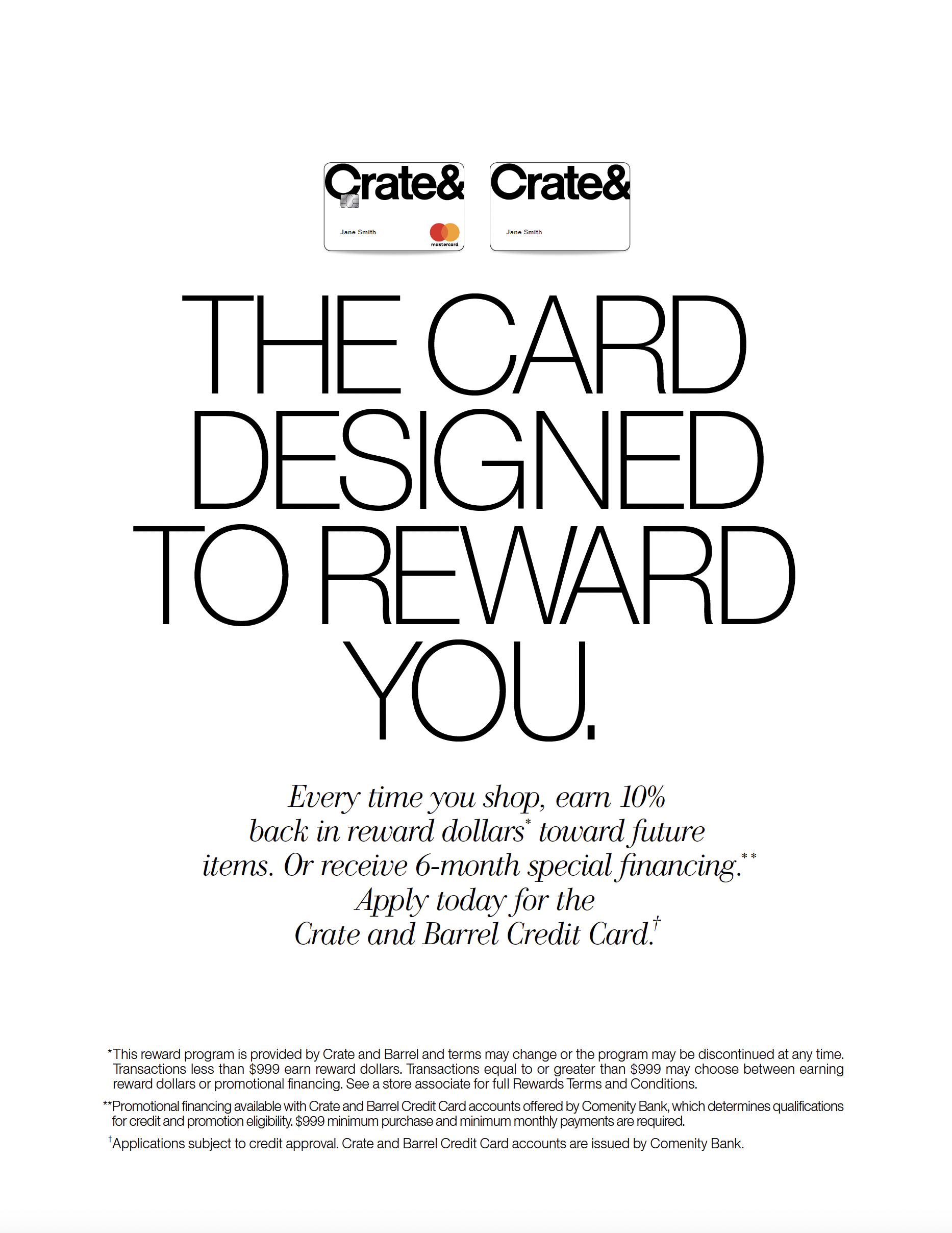
The Crate and Barrel Credit Card rebrand was an opportunity to update this division of the brand in order to appeal to the new Crate customer and continue to reward the loyal base as well as partner with a new financial institution. The card’s new faceplate took on a clean, minimal look while making a connection to the iconic Crate and Barrel shopping bag.
Problem
To relaunch the store credit card as a rewards card that provided more of an incentive to encourage customers to shop, earn reward dollars, and cash in the rewards dollars on future merchandise. Visually the card and marketing around the card was out of date and did not appeal to newer customers.
Role
Lead Designer responsible for ideation, print design, photo art direction, cross-functional collaboration, and production
Process
Faceplate Design
Brainstorming
Design
Concept Presentation
Photo Shoot
Omni-channel Collaboration
Production
Delivery
Solution
The rebrand and launch of the store credit card program was fresh and approachable while still maintaining a connection to the iconic Crate and Barrel brand. The rewards card, distributed by Synchrony Bank, offered a more appealing program which led to an increase in card applications.
Tools
Illustrator
InDesign
Photoshop
Duration
7-8 months
The Before
Before the rebrand there was not much attention paid to the visual qualities of the marketing materials around the credit card program or the card itself. It was presented in a straightforward manner that lacked connection to the user and did not appeal to new customers. In this particular piece the card feels unachievable, almost monumental. The goal was to make the card seem like a part of the customer’s every day life.
Concepts
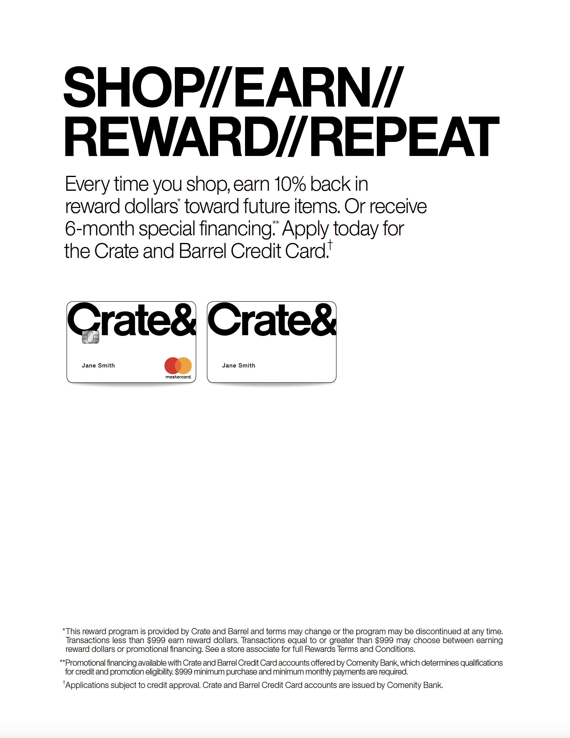
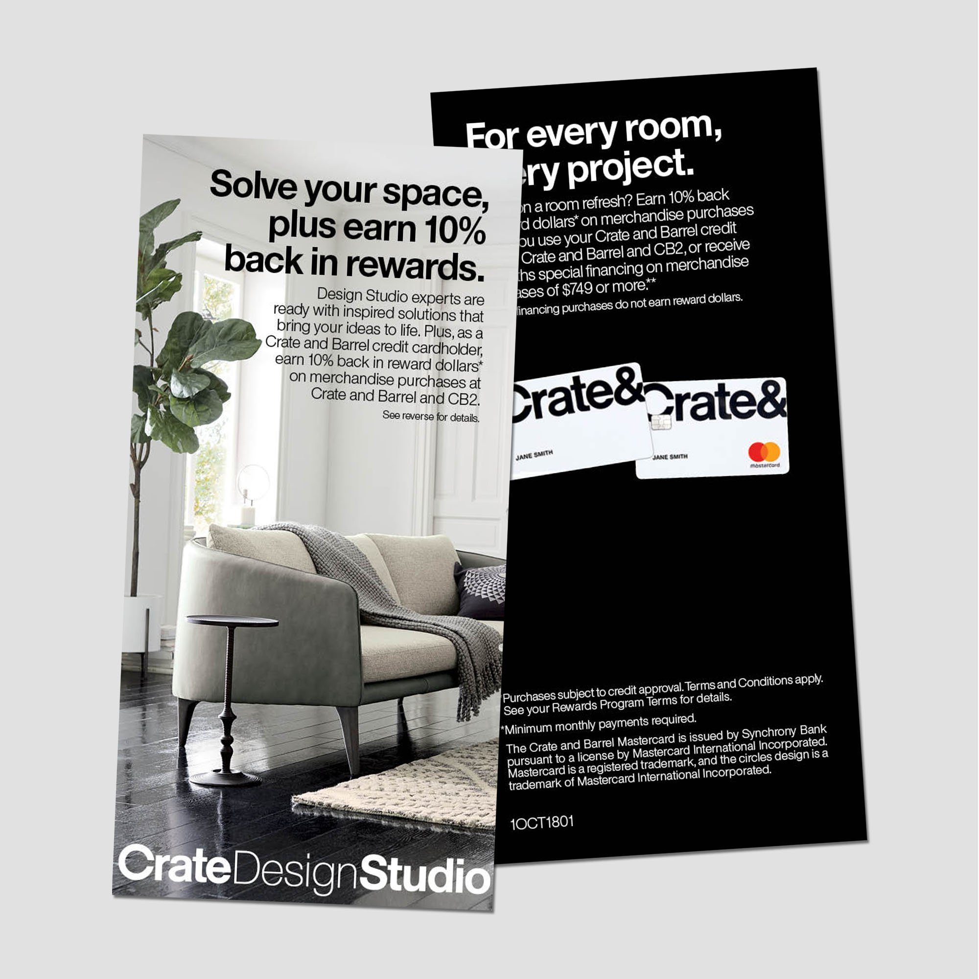
From the messaging to the visual look and feel, the new card was meant to feel approachable and open to all. The redesign of the faceplate from black to white, mimicking the white Crate shopping bag was the first update that brought the program into a more current space. The ampersand was used as a way to pull together the steps of the rewards process as well as a visual nod to the new faceplate dropping the word, Barrel.
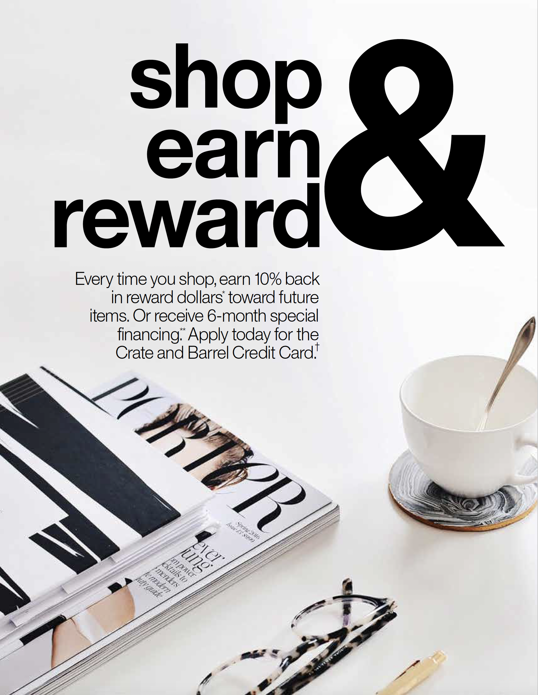
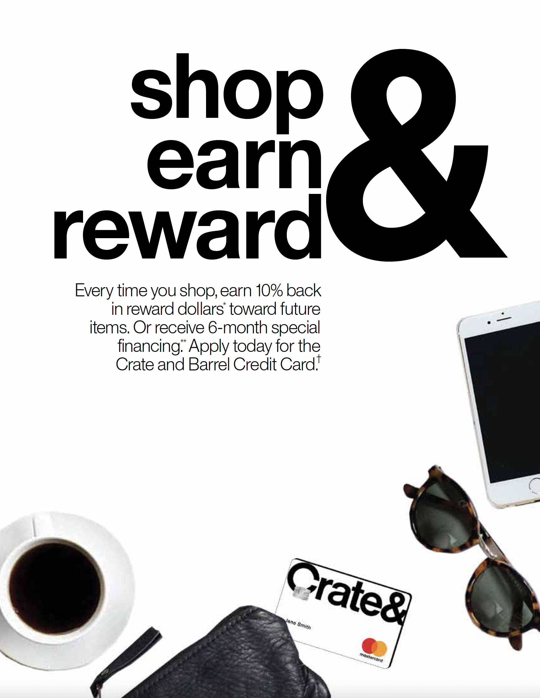
I experimented with lighter weights of Helvetica, mixing in Bodoni Italic, and increasing the amount of white space to increase the sophistication level. The photography concepts connected to the approachability factor of the rebrand, showing the card among other everyday tabletop objects as if the customer was on their way out the door to shop or browse the site for merchandise.


The Photo Shoot
The concept behind the photography and additional collateral was to be direct but approachable by making a connection to the cardholder’s everyday routine. A cup of coffee, phone, notebook and writing utensil all acted as props to communicate this idea. I chose a black on black background for the evergreen shot to allow for the card to stand out and maintain the overall black and white palette of the brand.
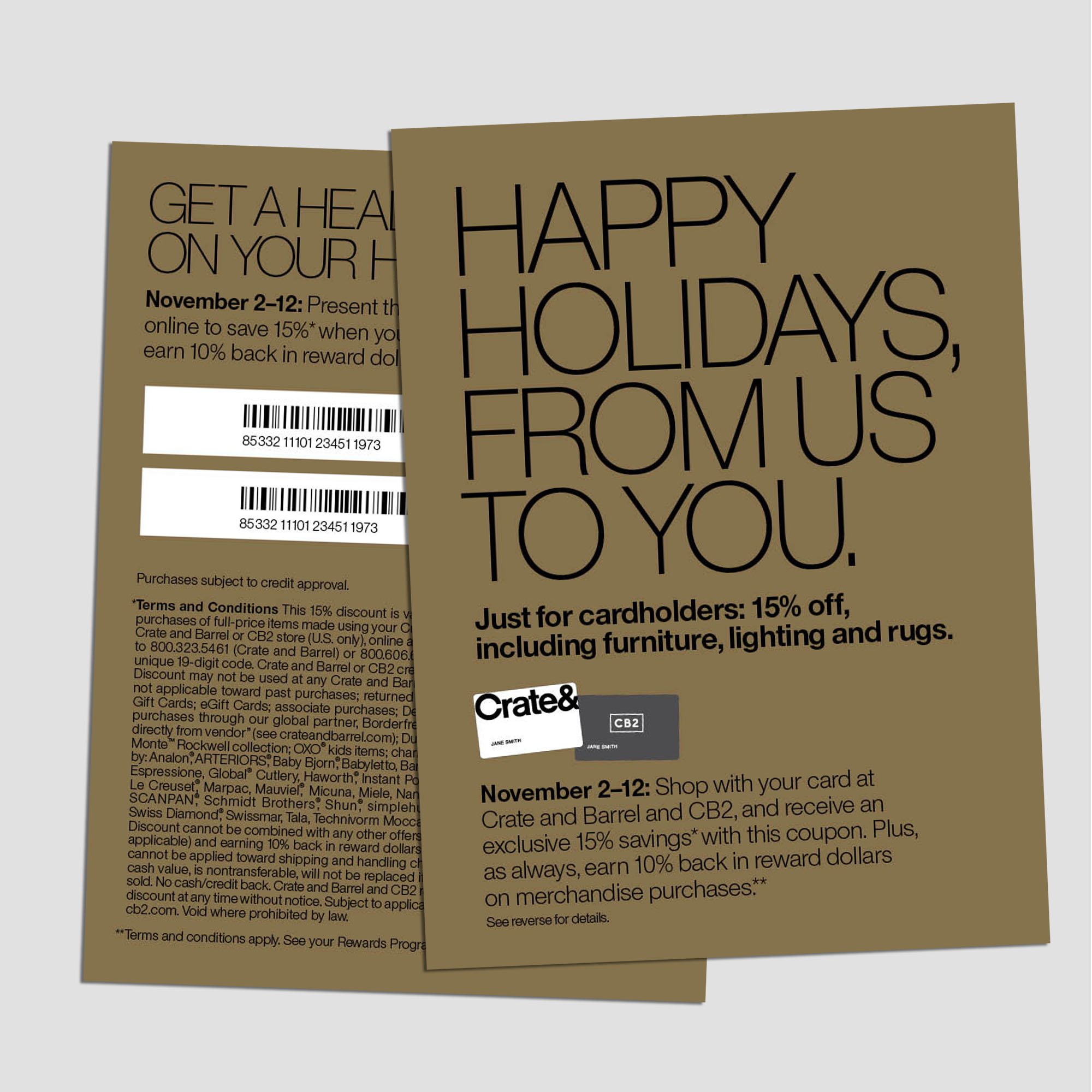
Holiday and Crate and Kids versions were also part of the shoot. The black was swapped with the turquoise brand color for kids and Crate’s traditional holiday red hue was used for both adult and kids versions to be used in holiday marketing. The props were also swapped out to accommodate each alt version.


Experiential and
Print Design
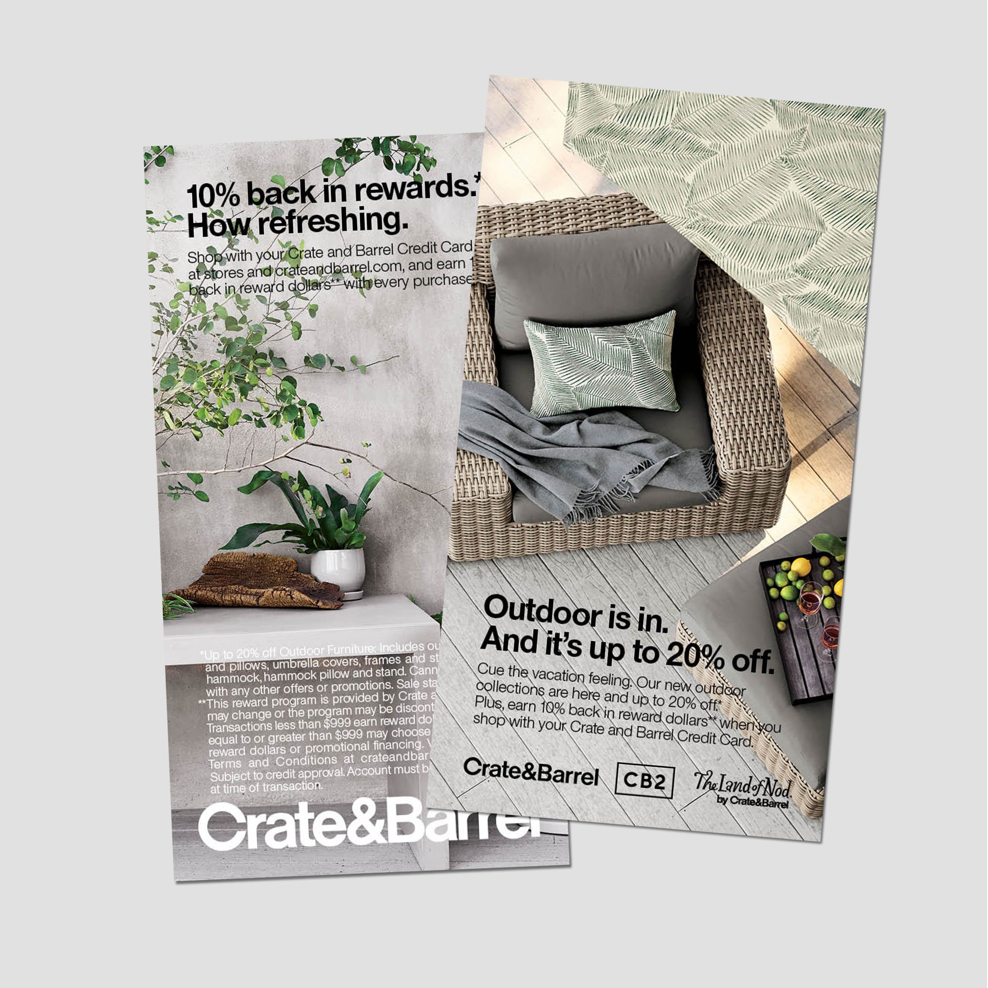
In-store signage and print design was my primary focus after the rebrand visuals and messaging was established. The cards (store and Mastercard) were shown overlapping from the top down in order to reinforce that idea of approachability. The tabletop photos were not used in the cases of signage and copy-heavy printed materials because it effected readability. Mastercard’s orange was used as a highlight color for promotional materials, especially for Double Rewards promos.
Other printed materials included direct mail postcards and printed marketing collateral included inside customer’s paper statements. Most direct mail pieces were dual branded with Crate’s sister brand, CB2. I collaborated directly with their designer to concept and execute these particular requests.


Digital Marketing
Another aspect of my role as the lead brand designer on the credit card rebrand was digital marketing. I created web banner advertisements to announce special promotions like Double Rewards or the Wine and Dine sale.
While merchandise photography was utilized for promotions like Wine and Dine the marketing for Double Rewards remained the same as the printed marketing to provide clarity and consistency in the messaging.