Web Design | Visual Design | Email | Print
SoLá Therapy
Overview
SoLá Therapy is a medical device company that created a new treatment for Chronic Pelvic Pain. SoLá Therapy is the only CPP treatment that activates your cells to help relax the pelvic muscles and calm harmful inflammation. With SoLá Therapy, you’re not just masking the pain, you’re empowering your own body to break the pain cycle. SoLá was a client I worked with during a contract role at Spur Marketing in Doylestown, PA.
Problem
SoLá Therapy was new to the medical device industry and wanted to
introduce themselves to patients and providers with a joyful, approachable
yet informative visual identity.
Role
Primary designer and production artist for landing pages, email, print collateral, and brand guide.
Process
Client Relations
Concept Presentation
Design
Iteration
Production & Delivery
Solution
Using the foundational brand assets (logo, palette, typography, iconography) provided by the client, I was able to build out their design system across the web, email, presentation templates, print collateral, and their brand guide.
Tools
Photoshop
Illustrator
InDesign
Duration
3-4 months


Brand Guide
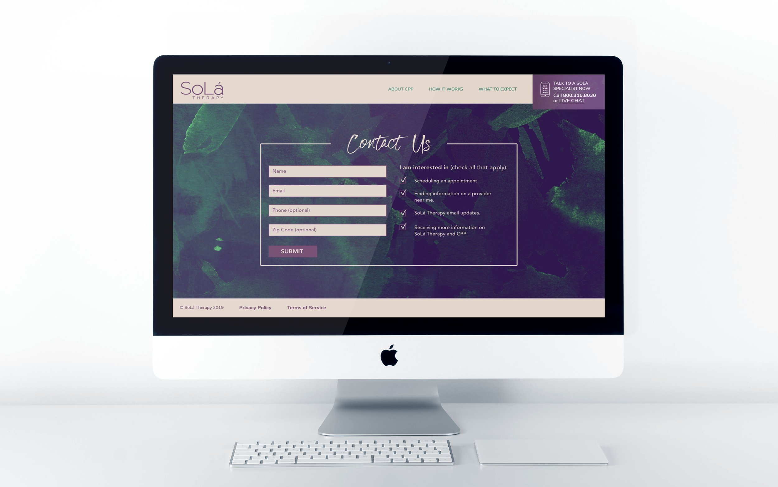
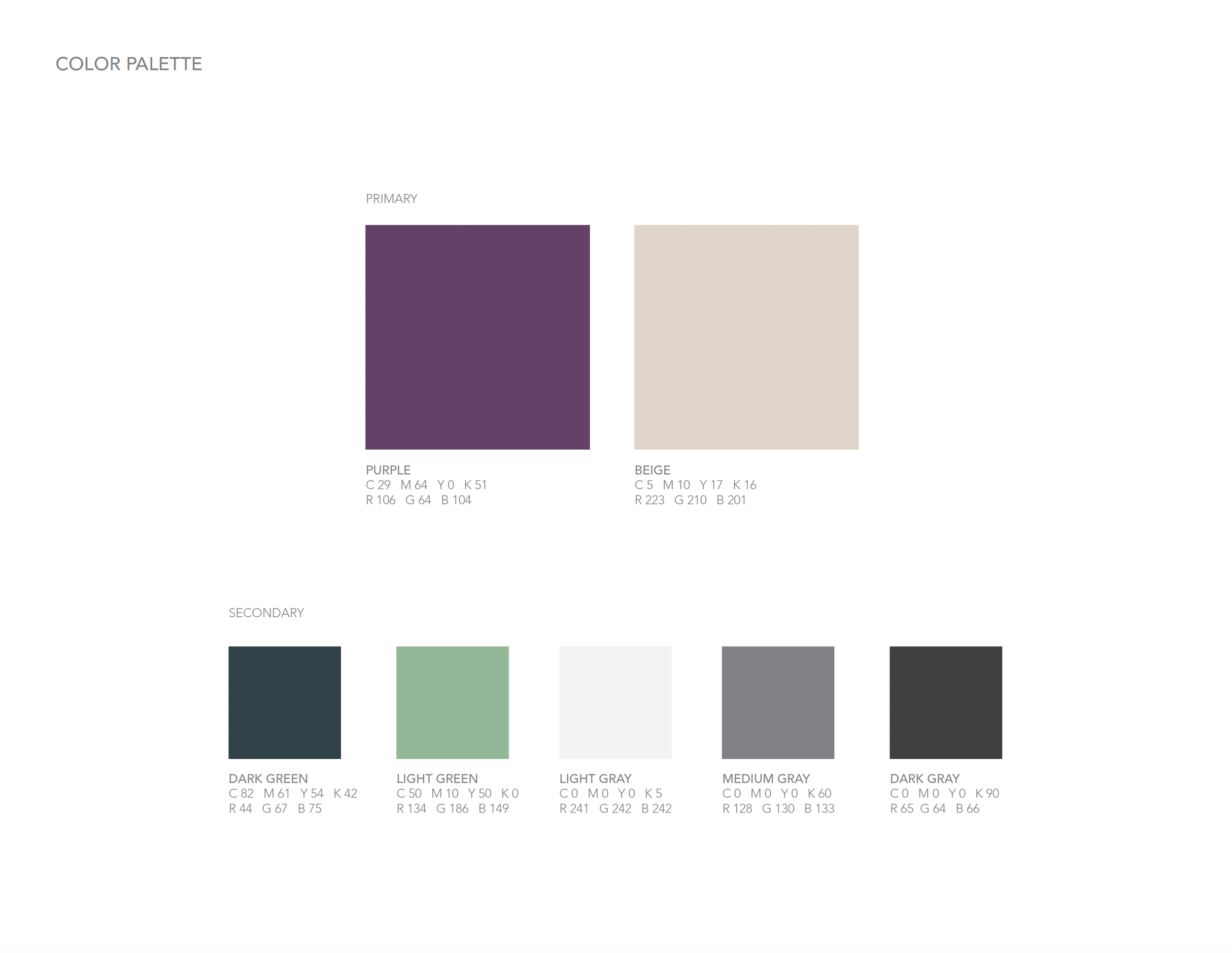
SoLá Therapy wanted to connect with patients on a personal level. The brand wanted to come across as hopeful, positive, and accessible yet professional and trustworthy in their messaging. The palette, typography, and icons were soft, feminine and calming in their simplicity.
The background textures made the connection to a more natural approach to pain management.
This email template I created utilizing the brand guidelines and placeholder text acted as a starting point for informative and promotional email correspondence sent by SoLá Therapy. The messaging remained personal and the visual softness and positivity
was present.
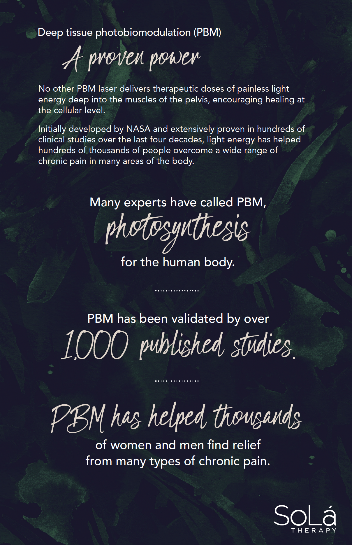
Patient Brochure
SoLá Therapy’s goal was to explain why they were different from other treatments for CPP in a clear, visual way to patients and providers. Photography, iconography, color blocking, typography changes, and texture variations were used throughout this brochure to inform in the most clear way possible.


