
Packaging Design | Illustration | Typography
Crate and Barrel
Scent Collection
Overview
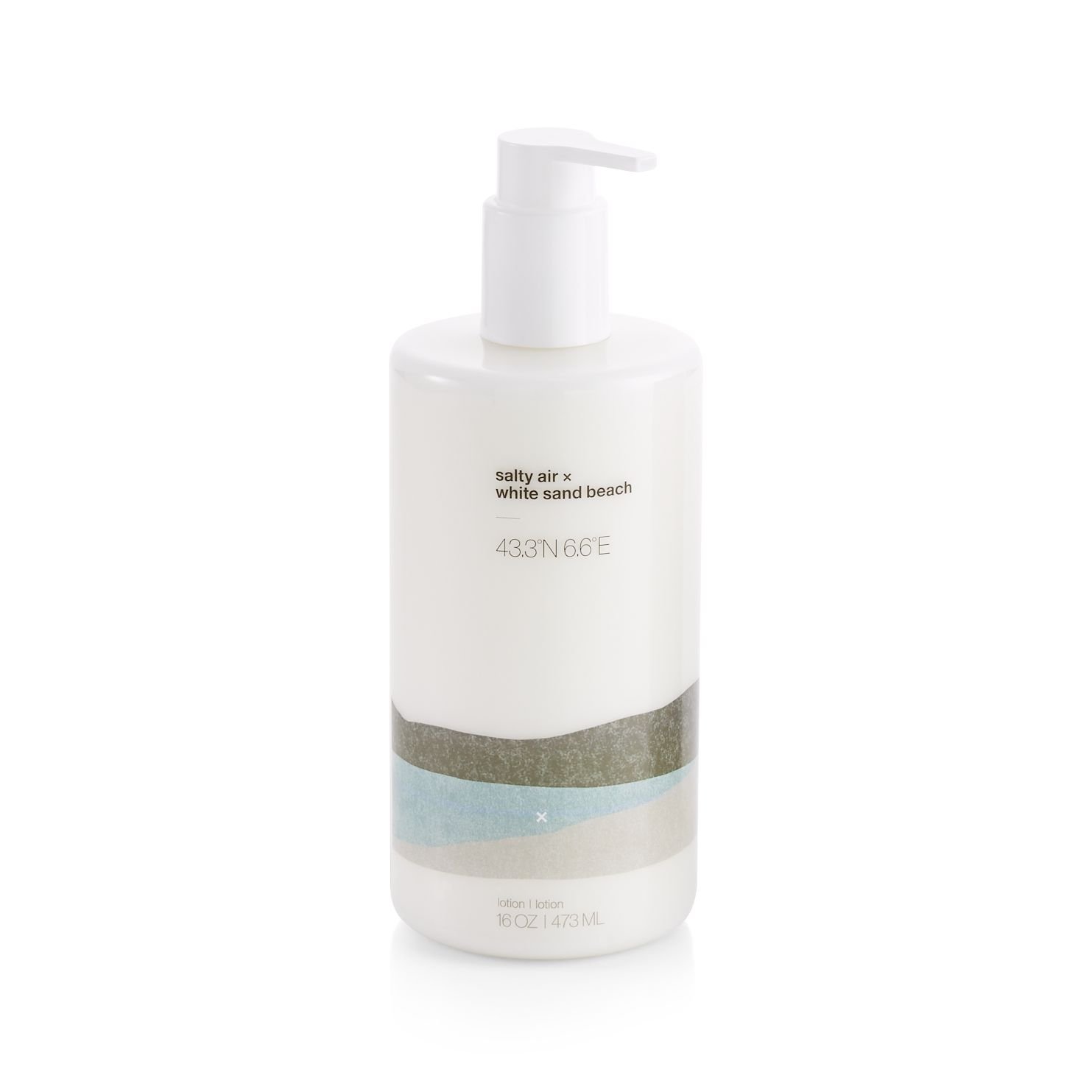
You Are Here is a collection of home and personal scent products by Crate and Barrel that take you on a journey around the world to explore 5 locations that have inspired unique scent profiles. The packaging tells the story of each scent by providing 2 pieces of natural inspiration as the scent name, the geographical coordinates of the place, and an abstract illustration of the landscape allowing you to transport yourself to each location as you experience the scent. Secondary messaging describes the place and notes in more detail on the back of the package. This collection represented the first time Crate and Barrel offered an in-house line of home and personal scent products.
Problem
The primary challenge I was faced with was to create packaging for this collection that made a connection to the brand’s origin story of bringing unique objects from international travel back to the United States to be shared with their local audience. Some executional challenges that arose were developing a system where consistency could be maintained across various product packaging substrates and containers and how to differentiate between the five scents.
Role
Lead Designer responsible for research, brainstorming, concept sketches, illustration, mockups, stakeholder presentations, execution, vendor communications, and production.
Process
Research
Brainstorming
Concept Sketches
Illustration
Mockups
Stakeholder Presentations
Design Execution
Vendor Communications
Production
Solution
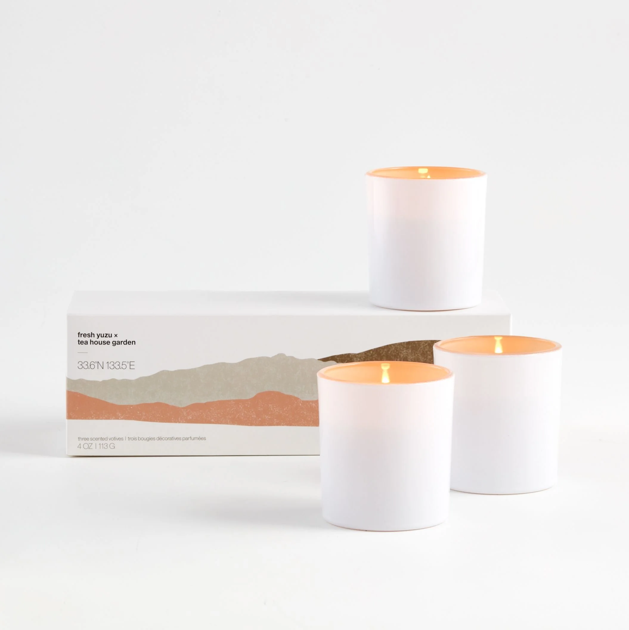
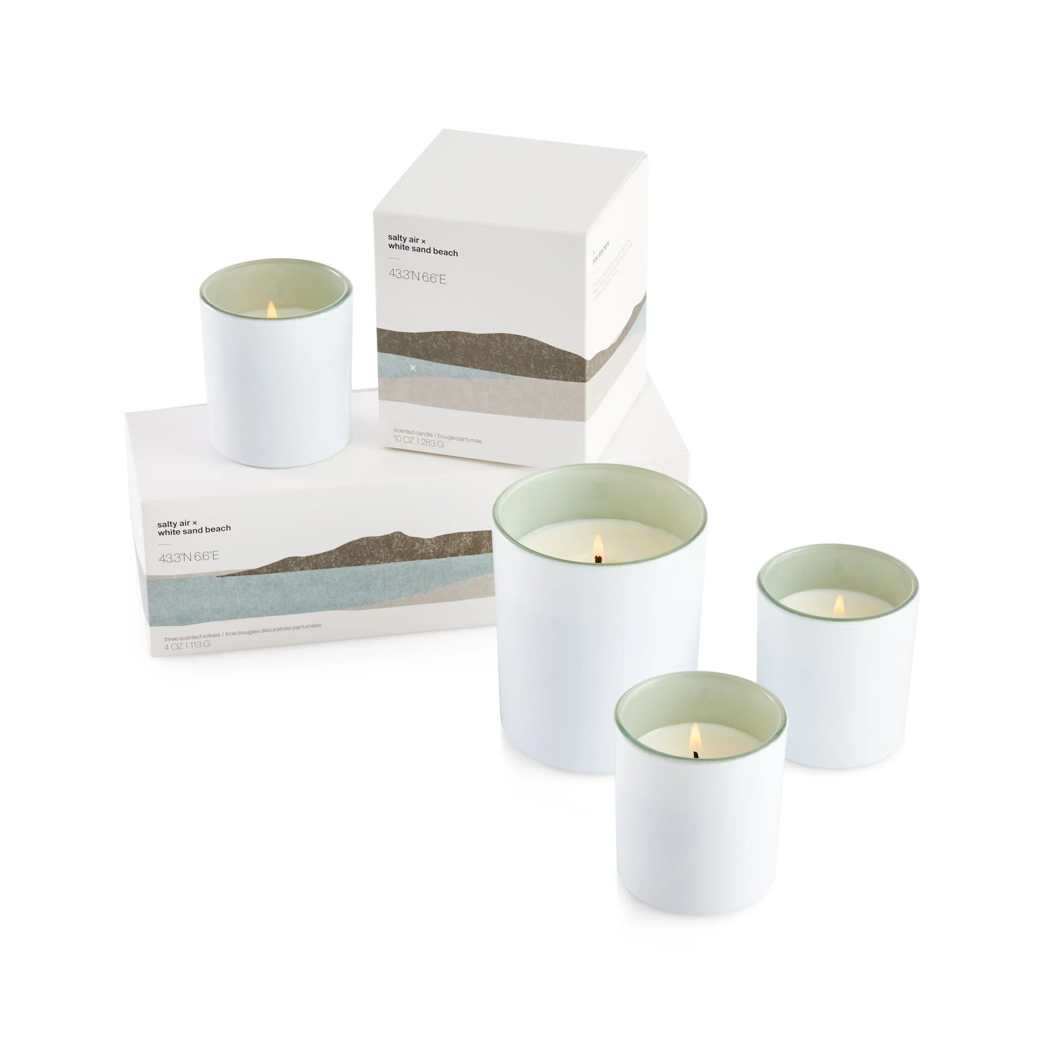
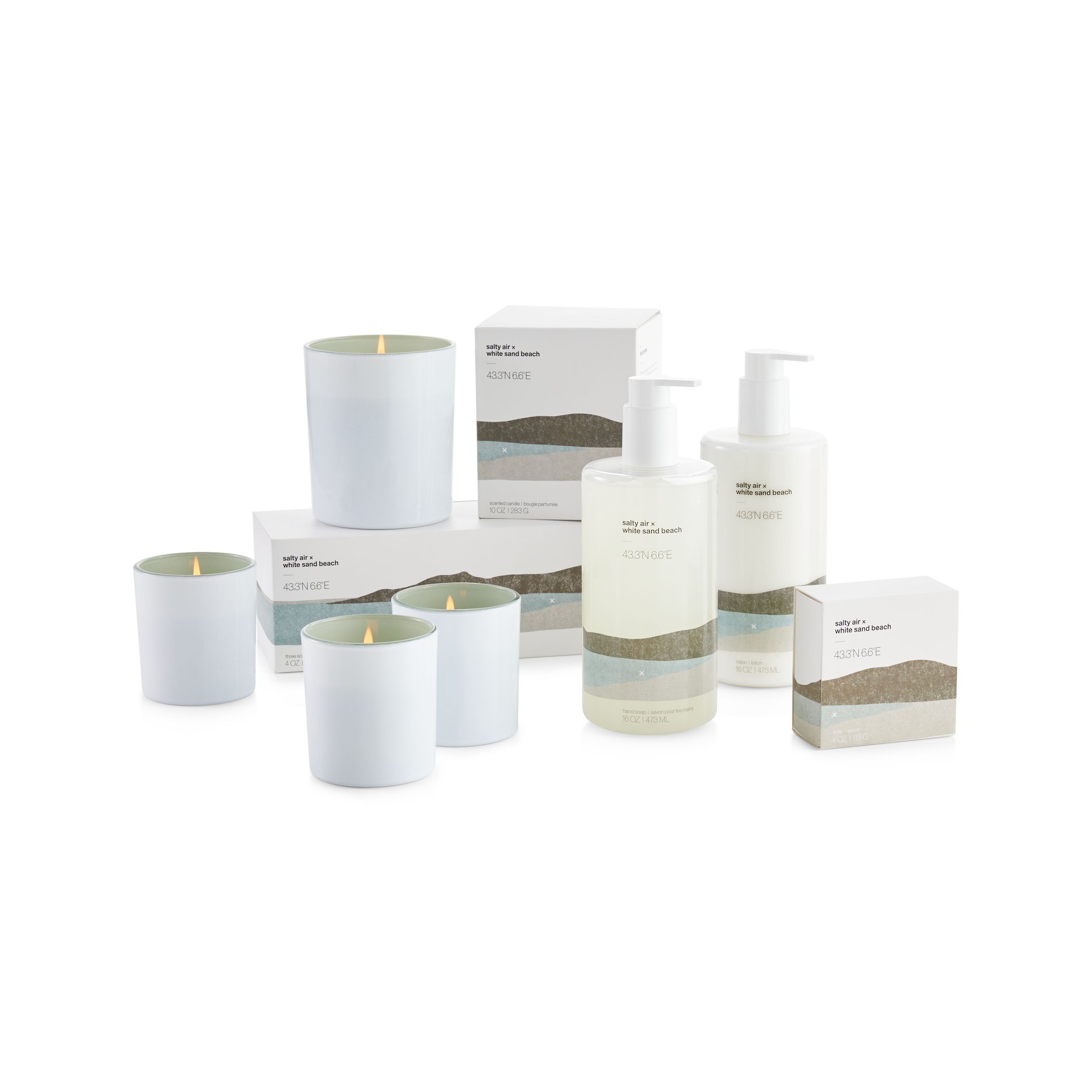
The final collection included various home and personal scent products (candles, soaps, lotion) across 5 unique scents each inspired by a specific location around the world. My designs for the collection included an abstract landscape of each location that the scent inspired created with a combination of hand and digital tools.
Tools
Adobe Draw for iPad
Illustrator
Photoshop
Duration
5-6 months
Research
TARGET AUDIENCE:
Frequent Crate and Barrel customer (“Savvy Stylist”) and new customers interested in home scents
Ages 28-65
VISUAL STRATEGY:
• Told the story of travel/destinations
• Clean, sophisticated, modern
• Illustration is primary focus
• Color identifiers for scents
• Consistency across substrates
Competitors
Restoration Hardware
West Elm
Williams Sonoma
Design: Illustration Process
Each scent represented a location where the notes originated from. Each location was described visually with an abstracted landscape and a unique color relating to the scent notes and location. Typographically, the locations were described with the exact geographic coordinates included on the front below the scent as well as with a short description on the back of the package above the ingredients information. I also included an X within the design to indicate the idea of ‘You are here’ or ‘X marks the spot’, phrases usually associated with maps.
Design: Mockups
The design for each scent was initially mocked up on line drawings of the products for stakeholder presentation. The landscape illustration was expanded or cropped to accommodate the various containers but placement in the bottom third to half was consistent throughout the collection. Warm grays were used across the collection for consistency and a soft, muted color was selected to indicate each scent.
To reinforce the location idea within the messaging, the exact geographic coordinates for each place were included along with the primary scent notes. A visual balance was struck when I chose to layout the scent notes in smaller, lowercase Helvetica above the larger, thin, all caps Helvetica for the coordinates below.

Bar Soap, Scented Candles, and Room Spray

Diffuser, Hand Soap, Hand Lotion, and Body Wash
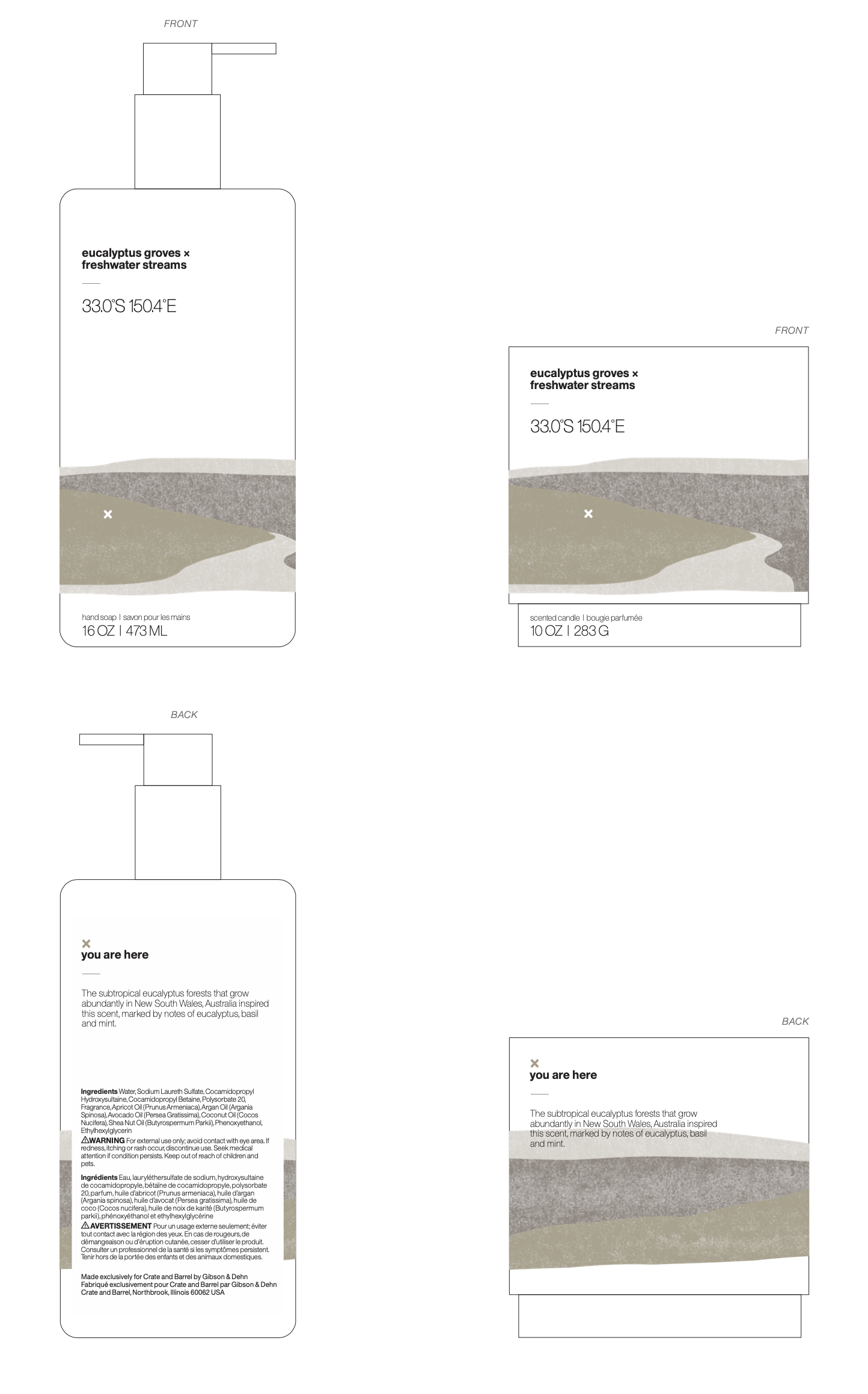
Hand Soap and Scented Candle
Final Packaging
While not all of the products initially proposed made it to market, the collection resulted in a sophisticated, unique take on home and personal scent products. The packaging was equal parts visually appealing and educational by providing the consumer with the story behind the scent.
The design consistency across product containers and the 5 scents helped to communicate the overall theme of the collection which was the value gained from traveling to experience and explore new places.


Takeaways
The packaging for this collection was successful in telling the story of the brand’s origin and providing a distinctive but consistent look and feel for all five scents across candles, soaps, and lotion. The product sales were strong and the line was available in stores and online from 2019-2021.
My personal takeaways include, having the opportunity to combine my passion for painting with my skills as a designer, being involved in the product development process as well as the packaging design process (even having a voice in the creation of the scents), and collaborating closely both product and packaging vendors to ensure the collection was executed on time while meeting high quality standards.