UX Design | UI Design | Visual Design | Branding
Good to Go
Overview
The Good To-Go product was created as a simple way for seniors or their caregivers to order fresh, healthy meals to be delivered to their home. The ultimate goal is to provide a product that helps decrease the hunger rates for senior citizens in the United States. This experience was created as part of the Google UX Professional Certificate Program.
Problem
Senior citizens can struggle to prepare meals for themselves and lack a simple and affordable method of getting healthy meals delivered to their homes.
Role
Lead UX Designer responsible for ideation, research, UX design, visual design, and branding.
Process
User Research
Wireframes
Design
User Studies
Prototyping
Iteration
Solution
To provide a responsive website and mobile app that helps decrease the hunger rates for senior citizens in the United States that makes meal ordering easy and affordable.
Tools
XD
Illustrator
Photoshop
Duration
1 month
Research: User Persona
TARGET AUDIENCE:
Senior citizens (ages 70+)
and their caregivers (ages 30-65)
Research: Competitors
Meals on Wheels
Magic Kitchen
Silver Cuisine
Mom’s Meals
Research: Questions & User Study Findings
RESEARCH QUESTIONS:
• Can users easily search for and customize meals for delivery?
• Are users able to use the search function filtering system?
• Can users access and set up a user profile?
• Can users understand how to complete the checkout flow for their order?
• Are users able to easily navigate to different parts of the app and site?
• Do users think the app and site are easy or difficult to use?
USER STUDY FINDINGS:
• Users mentioned the customization feature as a modal could be problematic.
• Users wanted to have access to delivery options during the checkout process.
• Users thought the profile creation should be an essential part of the flow rather than an option.

Joe, user study participant
“I like that you can jump right into ordering without a bunch of different introductory screens.”
Design: Wireframes and Low-Fidelity Prototype
My main goal with the ideation phase for Good To-Go was to make the user flow simple and straightforward for any user. I wanted users to have to be able to access the product’s main functions in the fewest steps possible. One of the main callouts during my first user study was that a modal for customization could be problematic if there are lots of customization options that would require scrolling. During the wireframe revisions I moved the function to the meal detail screen.
During the second iteration of the digital wireframes for the Good To-Go app I included a more informative home screen to explain the user flow, extensive filtering available from the search screen, and a screen for users to create their personal profile to store their preferences.


LOW FIDELITY PROTOTYPE
The user can begin their journey by either searching for meals to order or setting up their personalized user profile in order to select and save contact and delivery information as well as food preferences, allergies, and dietary restrictions.
Design: Mobile App Mockups and High-Fidelity Prototype
The purpose of the home screen of the mobile app is to inform a first time user. However, after the second usability study, with the high-fidelity prototype, the feedback was that the initial home screen layout was not a good use of space and it was not able to be bypassed for return users. The series of 4 pop-up modals were added to give users a brief walk-through of the app’s functions with the ability to bypass when needed.
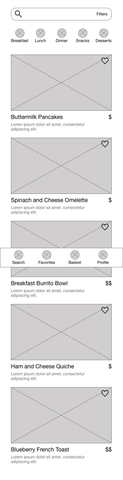
The search function is one of the primary functions of the app. Before the usability study the meal options were not presented as a clickable card with button but rather just a listing of images and text. After receiving the feedback, the search screen was simplified and cards were created to increase visibility and organization of the information.

Before Usability Study
After Usability Study

Before Usability Study
After Usability Study


HIGH-FIDELITY PROTOTYPE (MOBILE APP)
In this version, the user can choose to view or opt out of a brief tutorial after logging into the app. The meal search feature has increased clarity due to the creation of clickable cards for each meal. The user also has the ability to create a user profile during the checkout flow.
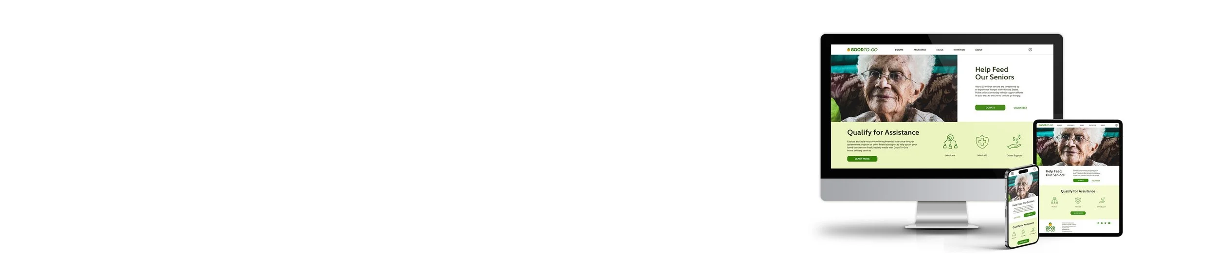
Design: Responsive Site Mockups and High-Fidelity Prototype
For the homepage of the responsive site I chose to focus on the donation and financial assistance aspects of Good To-Go. The other functions of the product, like the meal ordering, are accessible via the top navigation.
The responsive website primarily focuses on collecting donations and informing users how they can receive financial assistance for the cost of their meals through various programs. Meal ordering and creating a personal profile are the secondary focus.
Design: Brand and Style Guide
My goal for the Good To-Go brand was to create a look and feel that felt fresh and appetizing but also friendly and modern. I chose colors that have a lot of contrast and relate to the warmth and nutrients in food. The use of italic font in the logo connects directly to the speed and efficiency in the delivery of the meals.
Logo
Icon
Takeaways
My hope is that my work throughout this design process can in some way inform how we provide services to seniors and assist their caregivers. I learned that users like to have options when using a product, what works for one may not be optimal for others. Designing responsively and considering how the app will function compared to the site was a integral part of the process.